
Yaaaassss happy Friday everybody! We made it and now it’s time for Part 4 of the New Year New Decor. I am helping you, my precious readers, get your houses in order step by flippin step.
If you’ve missed it here links to part Steps 1 – 5
Step 5: http://yaydecor.com/2015/01/23/part-3-new-year-new-decor/
STEP #6 COLOR is what’s up today.
I think this is the part where the rubber meets the road, and things become a little bit more visual for everyone. We went over all of the things inspirational and functional, and it’s now starting to come together. You’re starting to understand the true design process, and why interior designers charge insane amounts like we do (fellow designers don’t kill me).
You have heard this before, that color is the biggest tool that us interior designers have in our toolbox. Color is everywhere. If you look around outside you’ll see Gods color palette. The blue skies meeting the green trees with the grey pebbles at the muddy brown waters. I mean that’s the perfect color story right there!
Before I help you select perfect color palettes by using your inspiration and other images you have collected so far; I want to debunk one myth about color.
Myth: colors clash – Umm no they don’t. Colors often work harmoniously together if they are used correctly. When I say correctly I mean you have to watch the tonal balances, the shades you’re using of certain colors, and the proportion of color that you have used in your rooms.
This is an amazing examples of a color scheme that you would not want to use in your mind, but works like a muther in person!
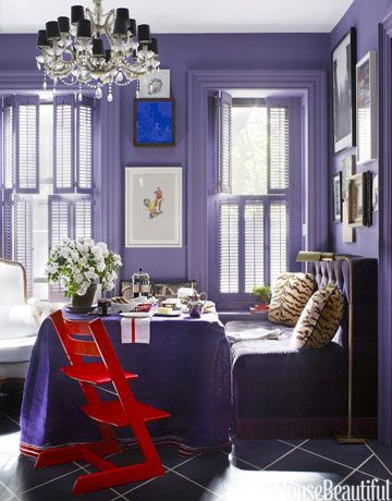
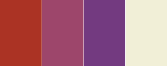
PURPLE WITH A POP OF RED – by designer David Kaihoi
Besides being pretty, there is a perfectly scientific explanation why it worked. Our designer friend David above used an analogous color scheme. An analogous color scheme is when there are three colors being used that are next to each other on the color wheel. The above example being purple, red and a dash of blue in the painting.
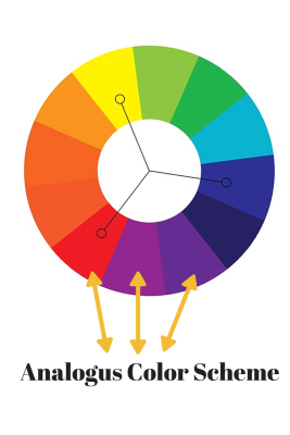
Brilliant right! He took a risk in his design simply by using one of the basic color harmonies. You can see more how colors work together here and get info on all of the color harmonies: http://www.tigercolor.com/color-lab/color-theory/color-harmonies.htm
Here is another example of how the same color scheme was used, but they played with the shades and tones:
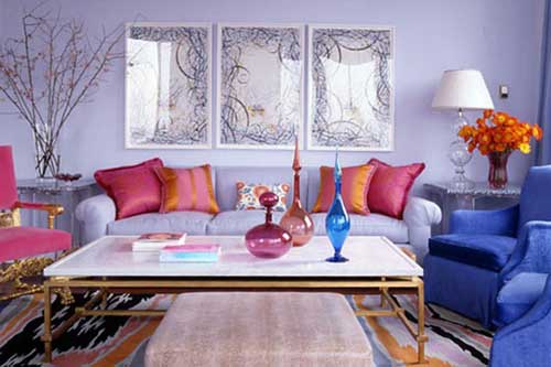
You can see that lighter purples were contrasted with deeper shades of blue violet, and accented with varying shades of red to make this room AH-Mazing.
Using your inspiration from Pinterest, Houzz or wherever else you found it. You can make color stories based off of what you collected so far. More than likely you will find a common thread with images that you’ve already selected.
If you have no clue where to start with your color inspirations I have a guide for you. The below guide is a tool that I use with my current clients when I do a color study. We simply go through it, and write “love or hate” next to the color names. If you if there is more than one decision-maker in the family, you can print out 2 of these, and do this for each family member. Using the common colors as your selections for your scheme.
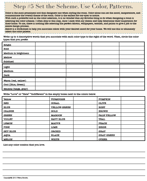
From the book 12 steps to designing your interiors
In combination with a more visual color chart (below) you can select your favorites in no time!
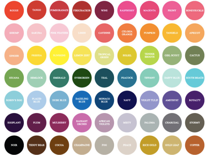
I found this color chart on a wedding site a while ago.
Note: I suggest using no more than 3 – 4 colors in you palette, not including black and white. My theory is to use a 60-30-5-5 rule:
60% of the first color (main color on the walls)
30% of the second color (larger furniture & window treatments)
5% of the third. (accessories/art)
5% of the fourth. (accessories/art)
(or 10% of the third color) (accessories/art)
Before you commit to any color scheme, make sure to grab swatches of your selections. This way you’ll make sure that the colors look great combined.
Here are some sites that are amazing with selecting color palettes:
http://pantone.com/pages/pantone/index.aspx
http://paletton.com/#uid=1000u0kllllaFw0g0qFqFg0w0aF
Next post is about Pattern. I am doing that one mid week. Especially since color and pattern are like first cousins!
Wanna read ahead?
If you want me to just get to the damn point of it all, you can download “12 Steps To Designing Your Interiors” (the entire e-book) by clicking the image here:
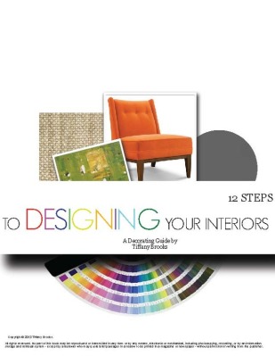
The book comes with all of the done for you worksheets and guides that you will need to get started on your space.
Many Blessings!
Your Interior Designer & HGTV Host


LOvE THIS!!!!! And those rooms are IT!
LikeLiked by 1 person
Great info, and the worksheet rocks!
LikeLike
YAYdecor Out of all there is to learn from in this room’s decor I am still gawking at that chandelier! How original and what a statement. Paired with the grey walls and flooring it really brings a focal point to the room. Even above the red chair. Once again, Im in love with your post.
LikeLike
I absolutely love this! Color is such a beautiful thing!
LikeLike
Reblogged this on jreicruz and commented:
so cutee ❤
LikeLike